With how many people are excited for oxygen and air’s revival I doubt I’m alone in thinking the new design is really ugly compared to the old one. And the logo is actually hideous
You need to keep in mind that we are part of a niche community (Fediverse), where most of the people (I’m betting) run linux and are pretty old-school in their FOSS and design mentalities. Any excitement that exists here is going to be skewed by confirmation bias in a network where everyone basically thinks the same.

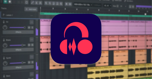
With how many people are excited for oxygen and air’s revival I doubt I’m alone in thinking the new design is really ugly compared to the old one. And the logo is actually hideous
Not to piss in your cheerios, but I like this new design.
The logo is kind of mid but it integrates with modern themes better than before (I will miss the old logo).
It’s an absolute blessing that they picked Qt instead of GTK and I want to see more of this.
deleted by creator
Yeah… That abismality called the new logo.
If a CLA is a kick in the groin, the logo has got to be at least ten thousand since for each contributor there’s at least ten thousand users.
You need to keep in mind that we are part of a niche community (Fediverse), where most of the people (I’m betting) run linux and are pretty old-school in their FOSS and design mentalities. Any excitement that exists here is going to be skewed by confirmation bias in a network where everyone basically thinks the same.
Well if we want non-foss examples, look at windows 11 and modern macos. Flat design is clearly finally starting to fall out of style
are you saying that the old one is like kde oxygen? i’m fairly sure the old one was also flat but worse